Kingfisher is an international home improvement company, with 1,300 stores in 10 countries. Its brands include B&Q, Castorama, Brico Dépôt and Screwfix.
Working as a Senior Product Designer at TAB, I helped Kingfisher shape their digital transformation for 12 months, designing features on iOS and Android, and helped lead the redesign of their responsive website. As well as designing features (like the one in this case study) I supported the lead designer, assisted with strategic planning and provided daily support, mentoring and direction for the design team.
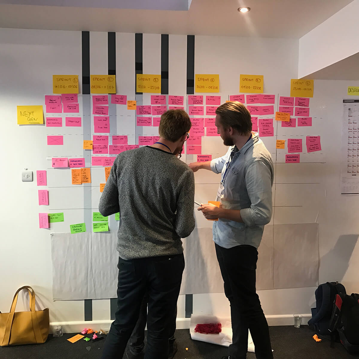
Myself with a lead developer discussing work for the upcoming sprints
The PLP gives the user an overview of a range of products. Users are able to browse, filter and sort results to help refine their search.
B&Q users could be late twenty year old professionals doing up their flat, to retired grandparents looking to maintain their garden. Screwfix users on the other hand are tradesman who purchase the same products several times a week. This wide variety of users means we always design for accessibility, and assume a very low tech competency.
During each round of user testing we made sure to ask additional questions to help develop our shared understanding of our users.
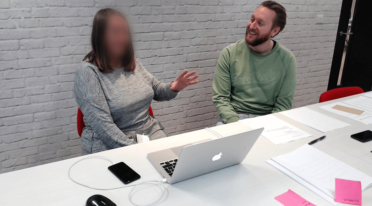
Myself and an interviewee during a user testing session
Once I understood the business and user goals, as well as the technical dependencies, I began exploring competitors to benchmark strengths and weaknesses. One area that was incredibly valuable to research was how much information is displayed within each product card on the competitors PLPs. There is a delicate balance between providing too much information or not enough.
A few of the competitors I looked at during the research phase

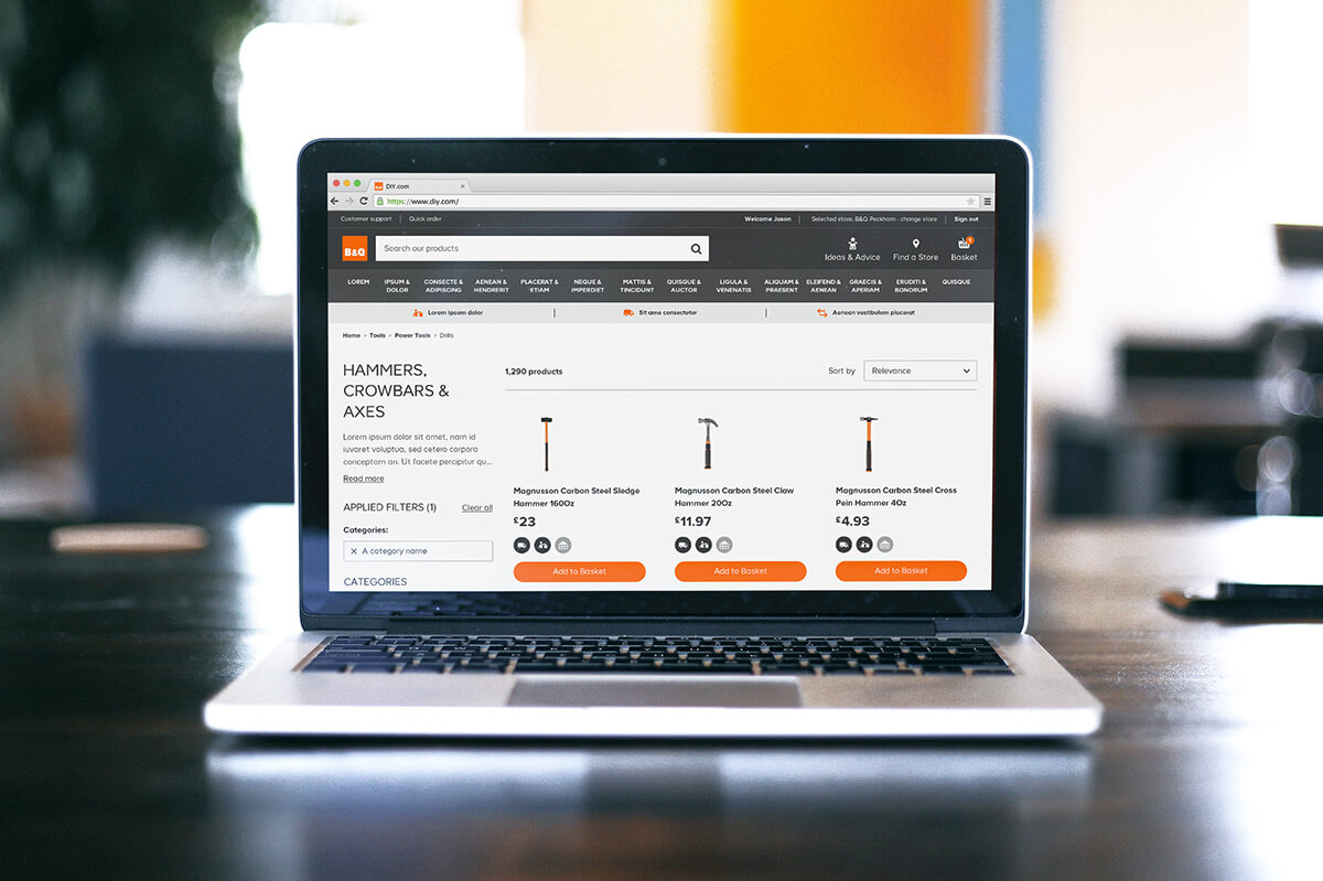
A screenshot of the original PLP
When starting a new design I like to loosely throw some ideas down on paper. This can empower quick conversations with other designers on the team, or provide something visual for developers to feed off. For the PLP I ran through several rounds of Crazy 8’s and sketching sessions with other members of the team to quickly explore potential solutions.
Some Crazy 8 sketches from a sketching session
A screenshot of the redesigned PLP

A screenshot of the grid
Our mission with the DIY.com (B&Q) website was to build everything in as reusable a way as possible. We only had 3 breakpoints (mobile, tablet, desktop).
We aimed to be able to do daily releases, and a big part of that is designing components that require as little CSS changes between breakpoints as possible.
That way we could make changes quickly and ship daily.
Screenshot of the redesigned responsive PLP
The product cards displayed on the PLP can come in a variety of options.
I think it’s important to design with realistic levels of data. A key task was therefore to note the different states a product card might need to display to ensure that all scenarios would be covered.
The product cards in the solution presented show how a card may look with varying levels of information available about the product.
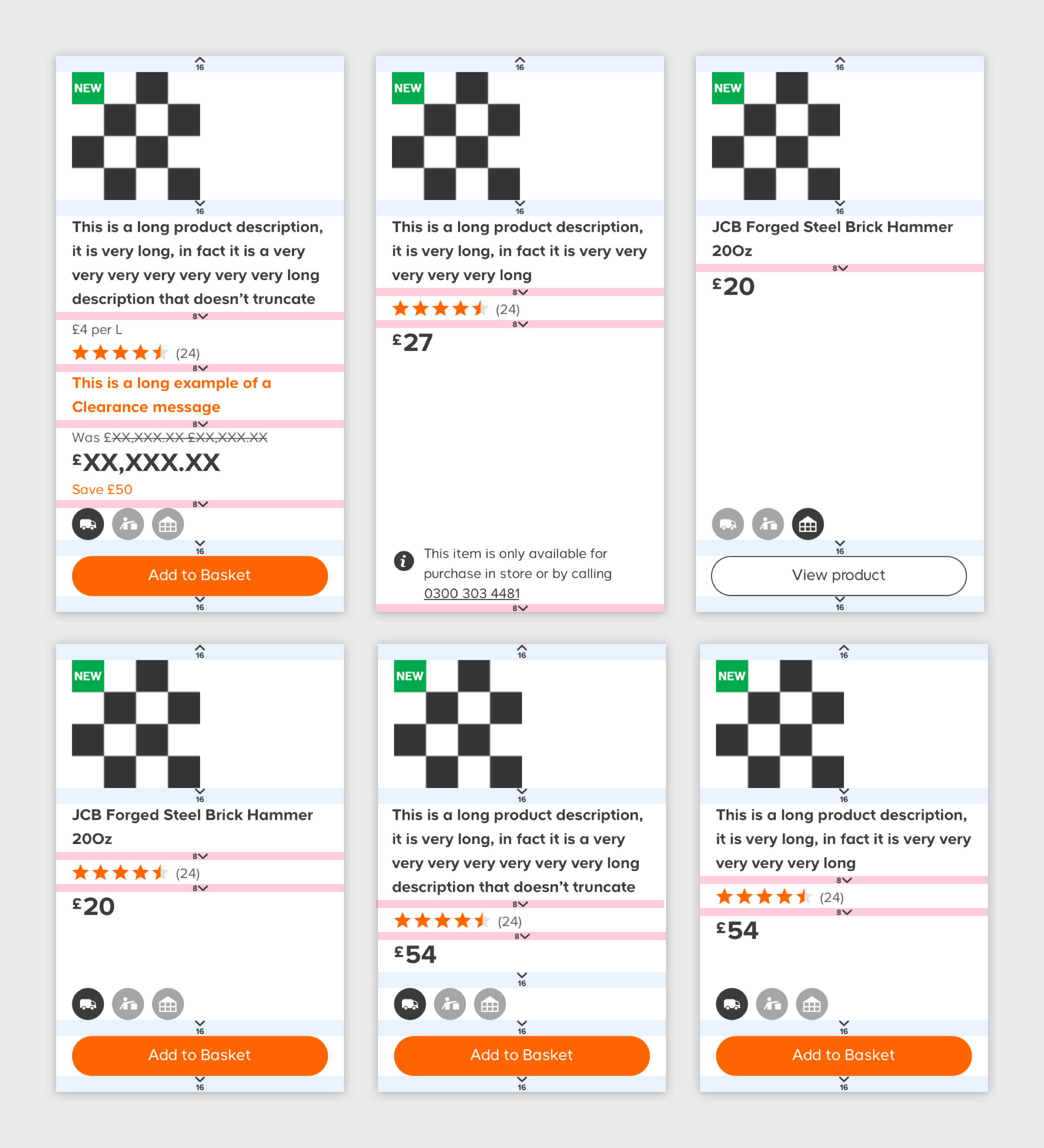
A selection of the product cards for various scenarios
I ran a usability test with six users of varying ages, genders and DIY competency using a Marvel prototype.
The goal of the session was to test my proposed redesign of the PLP and quickly catch any high priority issues.
I gave the users a scenario where they had to find a specific drill on DIY.com based on information I gave them about the product.
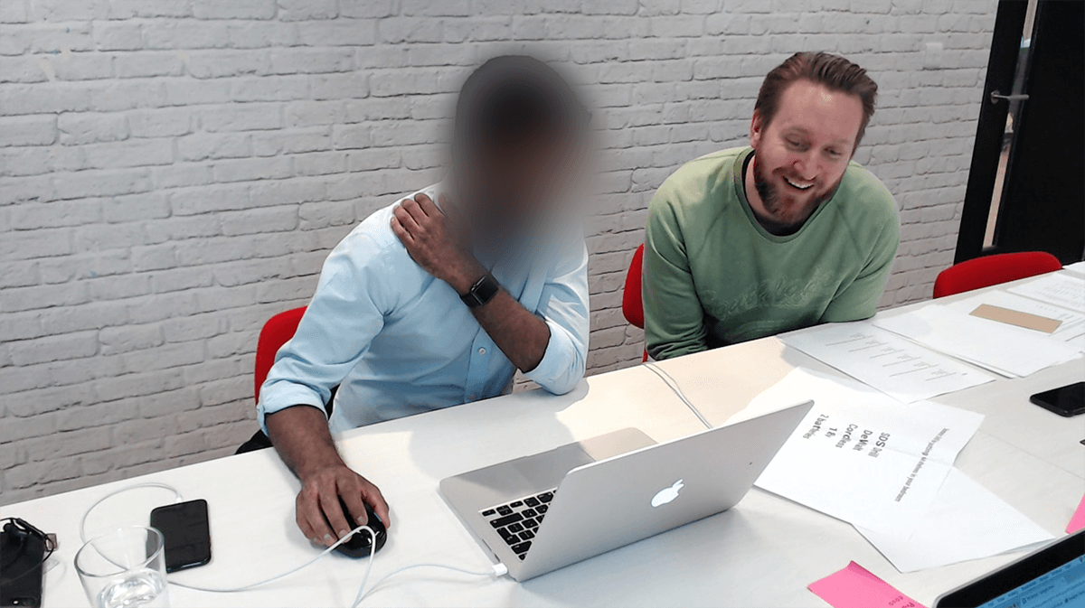
Myself and an interviewee during a user testing session
Following the session I created an affinity map on the wall so we could add notes of what we had learnt.
We then clustered the notes to spot recurring issues.
I then created a deck to share the key learnings with the client and gave each issue an Impact Score, Frequency Score and Priority to educate the client on where we should invest our time to improve the designs.
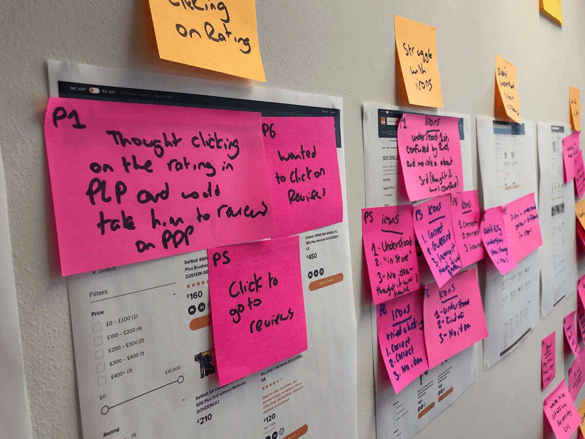
An affinity map after a user testing session
I received this feedback from Kirsten Groves, Head of Digital Experience and Web Proposition at Kingfisher
“Joe did an excellent job of focusing on showing just the right amount of information to our users and made sure that the new PLP still feels familiar. He shared his process throughout and was always able to back up his design decisions with a clear rationale to help either the business or our users.”