K2 Space are an interior design firm and our brief was to create a visually stunning website that truly represented their brand (common feedback was that their existing site made them appear much more corporate than they are), and with a strong focus on lead generation.

Getting into the minds of potential users is critical to understand what they might want from a product.
K2 Space will likely be chosen by Office Managers.
I found five people that would make the decision on which interior design firm to go with. I asked them to walk me through six competitors as well as K2 Space's current website (without telling them that K2 Space was our client) to gather honest feedback on what they were looking for from an interior design firm's website.

The existing K2 Space website which felt very corporate and was putting off younger tech companies.
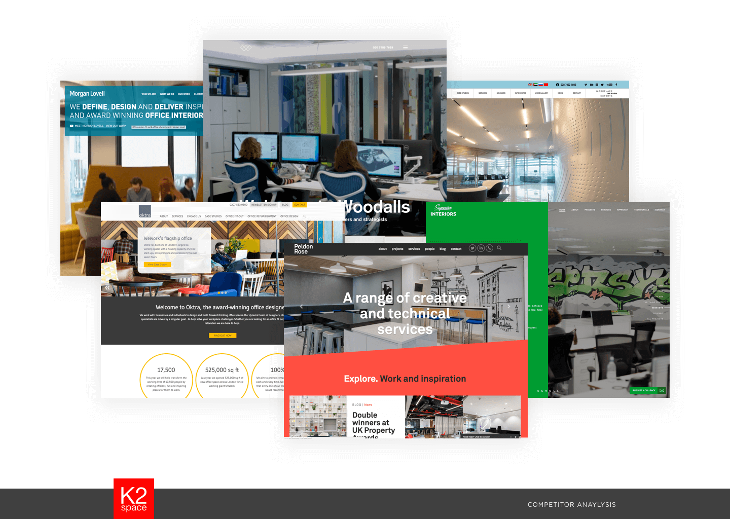
A selection of the competitors that I tested with users ranging from firms that specialise in corporate interiors, and others that focus on techy/modern interiors.
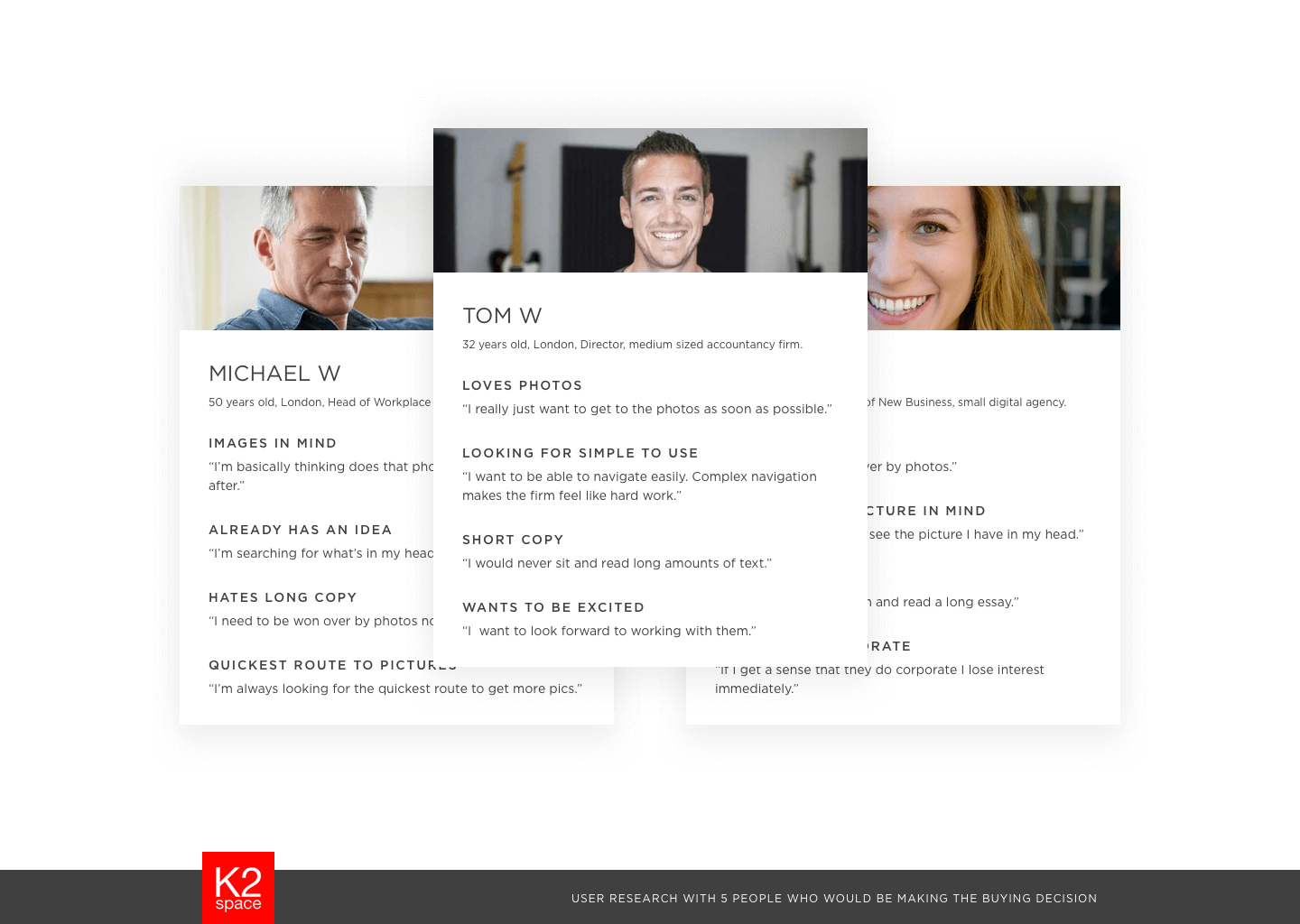
Feedback from three of the users which gave fantastic insight into the direction we should take. I've added stock images to keep identities private.
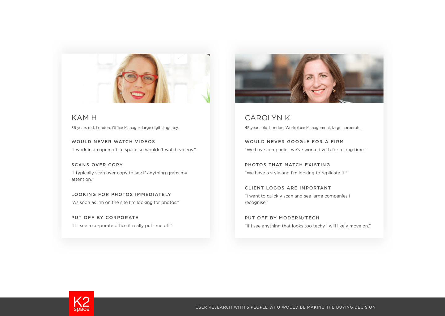
Feedback from the final two users which gave fantastic insight into the direction we should take. I've added stock images to keep identities private.
Summarising all the feedback from the different users gave us a strong baseline to know which direction we should go in.
Based on the findings during the user research I knew that the website needed cleaning up with as much clutter removed as possible. Users said that they wanted the site to feel effortless, with a focus on the photos so I did a lot of research into websites that specialise in simplicity and images.
I prepared a moodboard for the client to share how I felt the site would benefit from a minimal, simple UI, tapping into the desires of the users I tested the competitors with.

Project moodboard to showcase a miminal focused aesthetic.
I explored several different styles with varying typography, layouts and colour palettes to show the client how their content might fit within a much more focused UI.
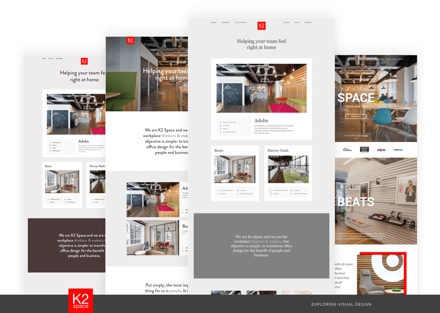
Several different visual treatments were explored. In the early stages I typically borrow copy from a competitors site to make it feel real.
The key areas of improvement based on our user research were:
There were subtle touches and influences from the competitors and moodboard that came together in the final design. One thing K2 Space were very keen on was the parallax effect they'd seen on a few of the moodboard sites, as well as the big eye catching statements reducing the copy length, and the huge amount of white space giving the content room to breathe.
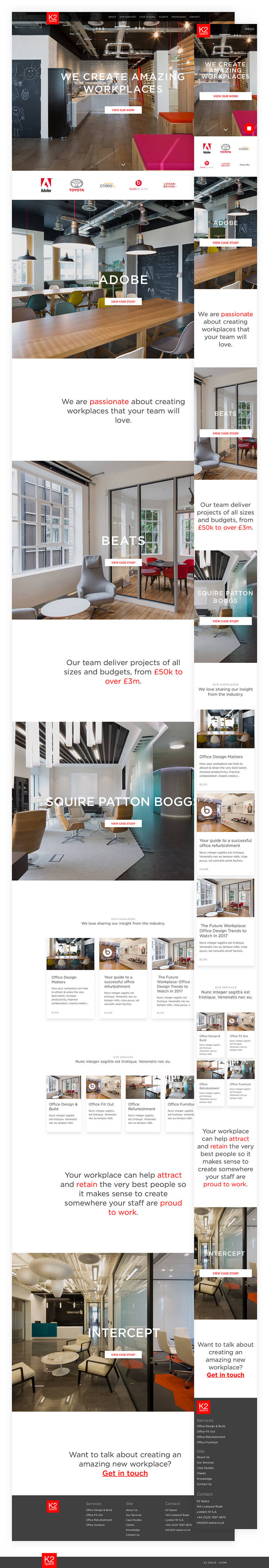
Final design for the homepage on desktop and mobile.

Final design for the case studies page on desktop and mobile.
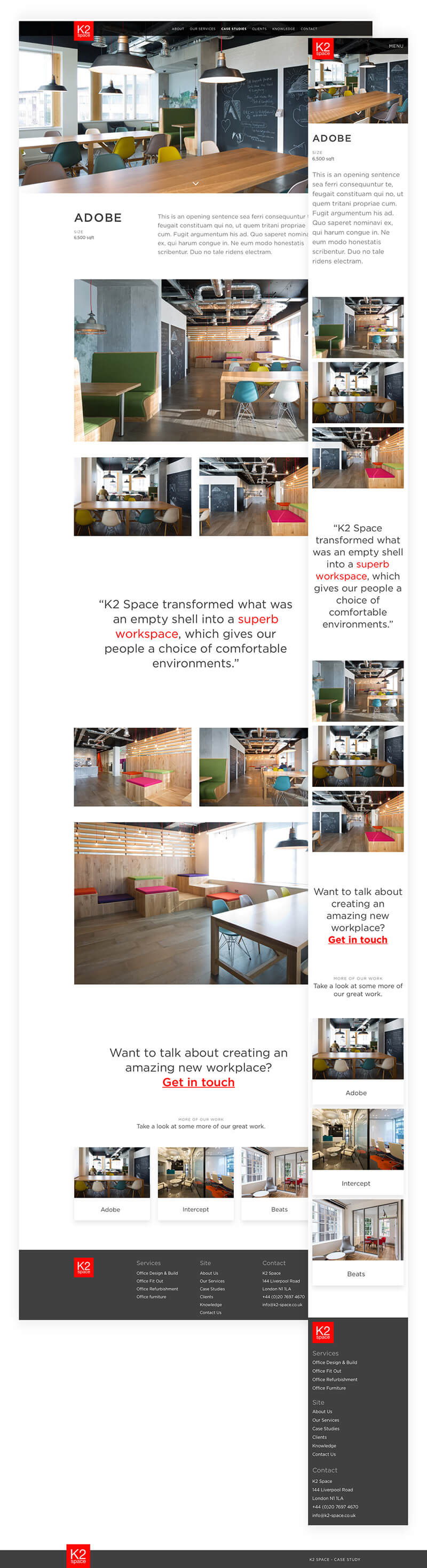
Final design for a case study page on desktop and mobile.
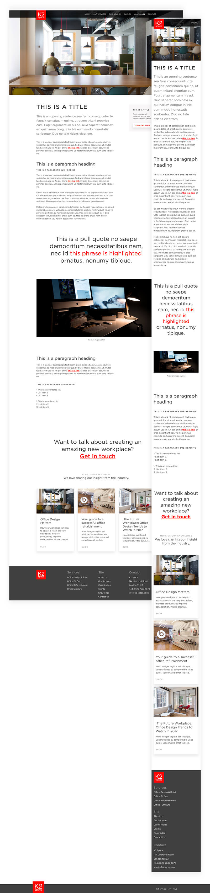
Final design for an article page on desktop and mobile.
Feedback on the site launch has been very positive. Time will tell if the site helps K2 Space generate more good leads but we're hopeful that they should be attractive to their new focus of tech companies in London.